![footer-logo.png]](https://help.intentwise.com/hs-fs/hubfs/footer-logo.png?width=210&height=40&name=footer-logo.png)
Brand Store Insights
Brand Store Insights AMC dashboard breaks your Amazon Brand Store performance down to the individual store page - Home, Bestsellers, Racing Frames, Micro Drones, and so on - and connects that traffic to the downstream purchases it produced.
This is something native Amazon Brand Store analytics can't show you: it reports store-wide visits, but it doesn't reliably connect which page a shopper viewed to what they went on to buy.
The dashboard runs on Amazon's onsite engagement events (store page views and dwell time) joined to the Retail Purchases dataset, for the date range and store/page filters you select.
The dashboard helps you answer three key questions:
- How much traffic and revenue is each store page generating?
- Which pages convert well, and which absorb traffic without converting?
- Does time spent on a page predict a purchase?
The dashboard is organized top to bottom as a funnel:
- Summary KPIs: how much traffic and revenue the store generated overall
- Top Pages by Total Product Sales: which pages generate the most revenue
- Traffic Share vs Sales Share: which pages over- or under-convert relative to the traffic they get
- Detailed Insights: Page-Level Breakdown: the full metric set for every page
- Avg Dwell Time vs Purchase Rate: whether engagement on a page predicts conversion
Header Controls
Use the controls at the top of the dashboard to customize the analysis.
- Account / Brand selector: switches which account is in scope.
- AMC Instance selector: picks the AMC instance the query runs against. Accounts with more than one AMC instance will see more than one option here.
- Choose a Dashboard: confirms you're viewing “Page-Level Brand Store Insights” specifically.
- Query Title: shows the name of the saved/scheduled query, e.g. “Monthly Execution for Brand Store Insights.”
- Date Range: sets the reporting window, e.g. 2026-07-01 to 2026-07-30.
- Store: multi-select, defaults to all stores selected. Useful for accounts running more than one Brand Store.
- Pages: multi-select, defaults to all pages selected. Lets you isolate one or two pages instead of the whole store.
- Download icon (per card): exports the underlying data for that card.
If you need the analysis run for a different period, reach out to help@intentwise.com.
Summary KPI Cards
Seven account-level totals for the selected date range and filters, giving the headline answer before any page-level detail:
|
Metric |
Definition |
|---|---|
|
Total Sessions |
Total visits to any page in the Brand Store. One user can generate multiple sessions, so this will exceed Total Users. |
|
Total Users |
Unique shoppers who viewed at least one Brand Store page in the period. |
|
Purchased Users |
Unique shoppers who visited the store and went on to purchase. |
|
Total Purchases |
Total purchase events attributed to store visitors. Higher than Purchased Users because a shopper can purchase more than once. |
|
Total Product Sales |
Total dollar sales attributed to Brand Store visitors across the period. |
|
Revenue per User |
Total Product Sales ÷ Total Users. Blends converters and non-converters into a single “value of a store visit” figure — useful for valuing traffic-driving spend (DSP, social, etc.) that sends shoppers to the store. |
|
User Purchase Rate |
Purchased Users ÷ Total Users. The account-level conversion rate for the whole store. |
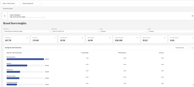
Header controls, the seven Summary KPI cards, and the Top Pages by Total Product Sales ranking.
Top Pages by Total Product Sales
A ranked list of store pages by Total Product Sales, sortable by other metrics from the dropdown in the card header. Each row also shows Purchase Rate, NTB Sales Share, and Rev/User alongside the bar, so you can see revenue rank and revenue quality in one place.
In the example above, the Home page tops the list in total sales — often by a wide margin — but converts at a comparatively low purchase rate and Rev/User. Category-specific pages, like Racing Frames or Batteries & Chargers, typically convert at a noticeably higher rate. This is a common, expected pattern: the homepage tends to capture broad, lower-intent traffic, while product-category pages capture shoppers who are further along in their decision. Read it as the homepage driving volume and category pages driving quality, rather than as a sign that the homepage is underperforming.
Traffic Share vs Sales Share
The key diagnostic table in the report. It places each page's Visitor Share (percentage of all store visitors) directly next to its Sales Share (percentage of all store product sales). A page whose Visitor Share meaningfully exceeds its Sales Share is absorbing traffic it isn't converting — the clearest single number for identifying where a Brand Store page is underperforming relative to the attention it receives.
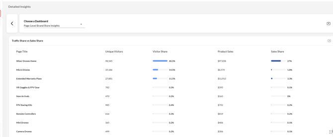
Visitor Share vs Sales Share by page — the traffic-to-sales mismatch diagnostic.
A gap between Visitor Share and Sales Share (as in the example above) highlights pages worth a closer look:
|
Page Title |
Visitor Share |
Sales Share |
Gap (Visitor − Sales) |
|---|---|---|---|
|
Wiser Drones Home |
40.5% |
27.0% |
+13.5 pts |
|
Micro Drones |
14.5% |
1.8% |
+12.7 pts |
|
Extended Warranty Plans |
11.5% |
3.3% |
+8.2 pts |
|
VR Goggles & FPV Gear |
0.3% |
0.1% |
+0.2 pts |
|
Remote Controllers |
0.3% |
0.2% |
+0.1 pts |
Detailed Insights: Page-Level Breakdown
The full metric set for every store page, sortable by column. This is the table to use for a closer, page-by-page look beyond the summary views above.
|
Metric |
What it measures |
Why it matters |
|---|---|---|
|
Total Sessions |
Visits to the page (a user can generate multiple). |
Raw traffic volume to the page. |
|
Total Users |
Unique visitors to the page. |
De-duplicated reach of the page. |
|
Avg Dwell Time (s) |
Average time a user spends on the page, in seconds. |
An engagement proxy — pairs with the correlation chart below to test whether time-on-page predicts a purchase. |
|
Purchased Users |
Unique visitors to the page who went on to purchase. |
The numerator for User Purchase Rate. |
|
Total Purchases |
Purchase events attributed to the page's visitors. |
Can exceed Purchased Users if shoppers buy more than once. |
|
Total Product Sales |
Dollar sales attributed to the page's visitors. |
The primary revenue ranking metric; drives the Top Pages card. |
|
NTB Total Product Sales |
The slice of Total Product Sales from New-to-Brand customers. |
Isolates acquisition value — sales from shoppers who hadn't bought the brand before. |
|
User Purchase Rate |
Purchased Users ÷ Total Users. |
Page-level conversion rate; the number behind the Top Pages purchase-rate column. |
|
NTB Sales Share |
NTB Total Product Sales ÷ Total Product Sales. |
What share of a page's revenue is genuinely new-customer acquisition versus existing-customer repeat spend. |
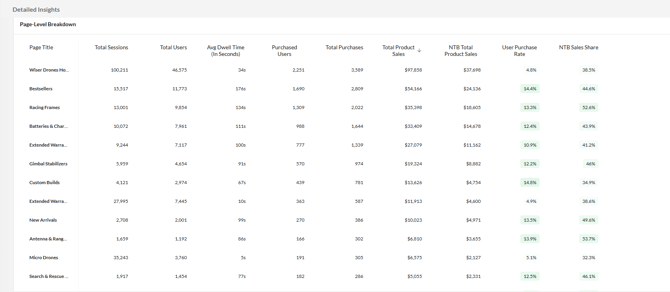
Full page-level metric table, sorted descending by Total Product Sales.
Avg Dwell Time vs Purchase Rate
A bubble scatter plot: the x-axis is Avg Dwell Time in seconds, the y-axis is User Purchase Rate (%), and bubble size is Total Users. A dropdown in the top-right switches between three preset correlations:
- Avg Dwell Time vs Purchase Rate (shown): does time-on-page predict conversion?
- NTB Users vs Dwell Time: do new-to-brand shoppers behave differently than repeat shoppers on a page?
- Store Visits vs Purchases: does raw traffic volume track with purchase volume, or do some pages break that pattern?
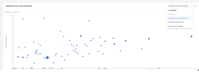
Bubble chart of dwell time vs. purchase rate; bubble size = Total Users.
How to read this chart
Treat it as exploratory, not causal. A widely scattered pattern with no clean upward line doesn't mean dwell time has no effect on purchases — it means it isn't the single driving factor for this account.
The most useful read is usually the outliers: a large bubble sitting high on the y-axis is a high-traffic page that also converts well, and worth studying as a template for other pages. A large bubble sitting low is high-traffic but underperforming — a pattern that should also show up as a gap in the Traffic Share vs Sales Share table above. Use the two views together to confirm a finding rather than relying on either chart alone.
Key Use Cases
Identify Underperforming Pages
Use Traffic Share vs Sales Share to find pages absorbing more attention than they convert into revenue.
Separate Traffic Drivers from Conversion Drivers
Compare Top Pages by Total Product Sales against Purchase Rate and Rev/User to distinguish high-traffic pages from high-quality pages.
Evaluate Engagement Quality
Use Avg Dwell Time vs Purchase Rate to see whether time spent on a page is translating into purchases.
Prioritize Store Optimization
Use the Page-Level Breakdown table to find pages that combine high traffic, high NTB Sales Share, and a low purchase rate — strong candidates for page-content or merchandising improvements.
Recommendations
- Don't equate top-of-funnel traffic with performance: a page can lead in visits or sales while still converting poorly relative to the traffic it receives.
- Treat the homepage differently from category pages: expect a lower purchase rate on broad-traffic pages, and use category-page conversion as your benchmark for traffic quality.
- Start with Traffic Share vs Sales Share when a page needs attention, then confirm the finding with the Avg Dwell Time vs Purchase Rate chart.
- Combine NTB Sales Share with Total Product Sales to identify pages that are strong contributors to new-customer acquisition, not just revenue.
Insights Dashboard Metrics Glossary
- User Purchase Rate = (users who purchased on the page / brand store visitors to the page) × 100
- Revenue Per User = total product sales on the page / brand store visitors to the page
- NTB Sales Share = (NTB product sales on the page / total product sales on the page) × 100
- Traffic Share = (the page's unique visits / total unique visits across all pages in the filtered set) × 100
- Sales Share = (the page's product sales / total product sales across all pages in the filtered set) × 100
Frequently Asked Questions
What data does this dashboard use?
It uses Amazon's onsite engagement events (store page views and dwell time) joined to the Retail Purchases dataset, for your selected date range and filters.
Why does the homepage often have a lower purchase rate than other pages?
The homepage typically receives broad, lower-intent traffic, while product-category pages tend to be visited by shoppers who are already further along in their decision. A lower purchase rate on the homepage is expected and isn't necessarily a problem.
What does it mean when a page's Visitor Share is much higher than its Sales Share?
It means that page is absorbing more traffic than it's converting into sales relative to other pages — a signal to review the page's content or merchandising.
Can I export the underlying data?
Yes. Use the download icon on any individual card to export the data behind that visualization.
Can I run this for a different date range?
The dashboard is generated for the range shown in the header. If you need the analysis run for a different period, reach out to help@intentwise.com.